As we all know, brands are more than just a beautiful website, although of course, everything adds up. A brand is much more, it is to keep it alive in each of the actions that are carried out, brand graphics, well designed interfaces adapted to any device, powerful photographs that convey sensations and emotions, videos that tell experiences, etc...
2019 is coming on strong and it does so with the presence of an eye-catching design full of personality.
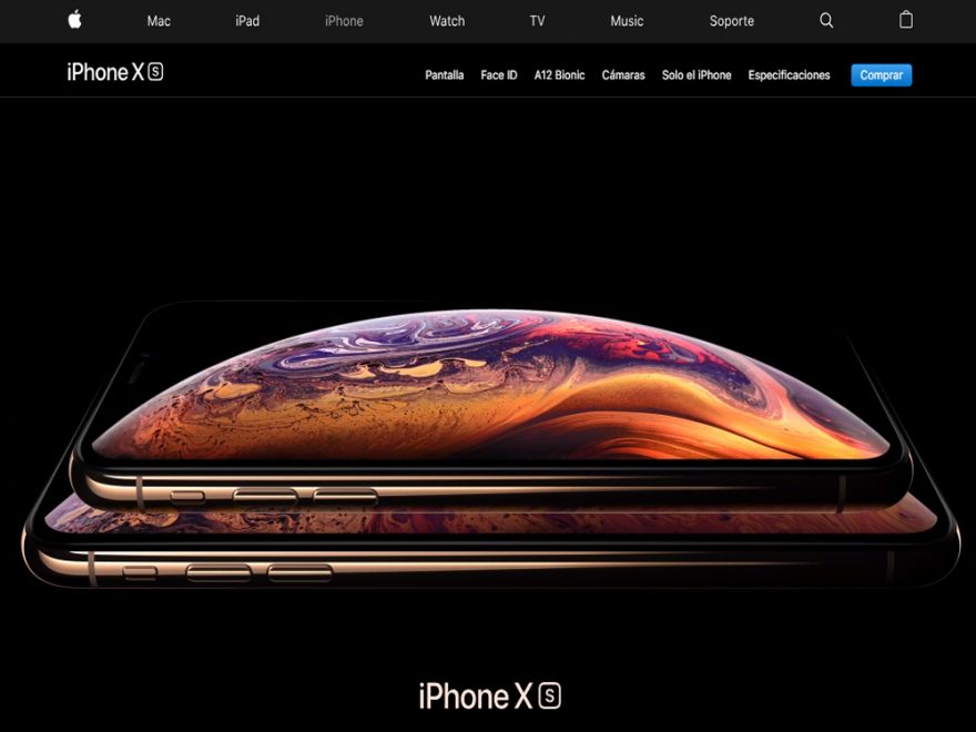
Big brands such as Apple, Zara, Ikea, ... show a minimalist design full of sensations. They are websites that transmit a lot with very little, they sell their product as a lifestyle and manage to attract our attention and store it in our memory effortlessly.

In the following, we will now focus on describing some of the points with the new web design trends for 2019 which, by the way, we love 😉
Some of the Web Design Trends for 2019
1. Design of unique fonts:
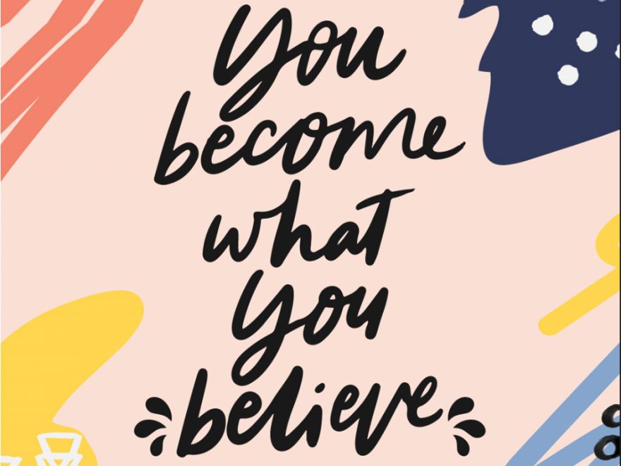
Minimalism takes precedence over all things and one of the elements where it will be reflected is in the use of a unique typography, and when we say unique we mean creating your own font. Handmade typographies, as in the case of Coca Cola. In case you don't know how to make your own typography, you can download it from pages such as www.1001freefonts.comwhere you can choose the typeface you want with typographies in this manual style.

2. Use of Bright Colour Palette.
We continue with the web design trends for 2019. The use of this type of palette with bright colours comes from years ago but, it seems that it is here to stay. Are you bored with the same old things? Well, this year 2019 comes loaded with new chromatic palettes, use of gradients and much more.
You can look at this page as a reference for the use of colour:

3. Use of Cinemagraphs instead of animated Gifs.
Cinemagraphs are photographs in which a moving and repeated action occurs.
It is produced by taking a series of photographs or video recordings and using image editing software to compose it into an animated gif. In this way, we perceive a repetitive or continuous movement. Make use of
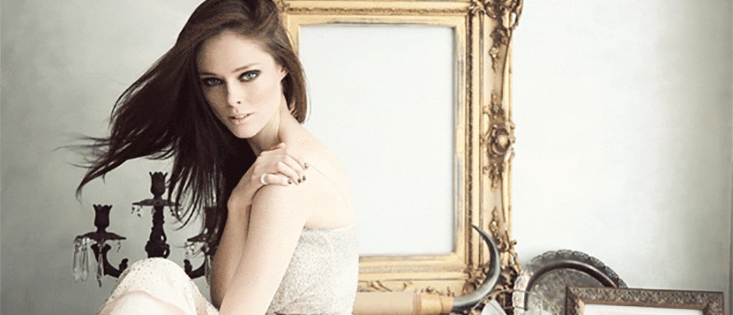
The use of Cinemagraphs in web design is latent so dare to use them.
Here is an example of an image:

4. Minimalism and use of modules
With so much rushing around in our day-to-day lives, we don't have time to stop and pause and read. Therefore, the web design is becoming more and more dynamic, minimalist and with specific calls to action to avoid distractions. You can see a wide variety of minimalist templates on the WordPress website.
With regard to the modules, we are moving away from the traditional standards of content distribution. We are now looking for a certain dynamisation in the placement of the content, especially visually.
5. Full screen video:
Over the years, we have gradually moved towards much more visual aspects in terms of web design is concerned. Nowadays it is what we consume most visually. The use of images and videos is the best option if you want them to stop and look at your brand.
Today we put the video in the first position on web designThe user will not have to be reading to get the information he needs, but will be visualising it.
See link: http://danielpastor.es/
Hopefully it will help you 😉.
